Saturday, November 30, 2013

Show’s lost berets at the ICA paint a picture of Pablo Picasso's influence on Britain


London’s young art enthusiasts were keen to adopt the fashion tips of the Spanish painter

Pablo Picasso’s influence on Britain was sartorial as well as artistic, according to a new book that reveals the high number of berets handed in to lost property during his Institute of Contemporary Arts show in the 1950s.
Never-before-published documents from the early years of the institution show that London’s young art enthusiasts were keen to adopt the fashion tips of the Spanish painter, who at that time was known for his distinctive headgear.
The institute, which was founded in 1946, featured his work in its first exhibition – “40 Years of Modern Art 1907 to 1947” – and staged two Picasso solo shows in the 1950s.
“Among the monthly internal bulletins was lost property,” said Anne Massey, an art historian and  co-author of History of the Institute of Contemporary Arts, the first history of the early years of the ICA. “One revealed that berets were left behind around the time of the Picasso show. He wore one and everyone was trying to copy him.”
Ms Massey and the ICA’s executive director, Gregor Muir, are in the process of pulling together thousands of papers from the early years of the institution.
Mr Muir said: “There has never been a book like this about the ICA. The tendency to talk about the ICA’s recent past overlooks its extraordinary history. Looking through the archives it becomes so clear how vital this has been as an institution.”
He added: “Until I looked at the material not even I had an appreciation of the role the ICA had to play in creating contemporary British art.”
The ICA had the first survey show of Francis Bacon’s work, and promoted artists including Henry Moore, Richard Hamilton and Lucian Freud.
Ms Massey added: “I was lucky enough to go through the first management committee minutes. They were very interesting and there were a lot of arguments. Many of those involved were surrealists so the meetings were off the wall. In the very first meeting they voted in 12 Herbert Reads into the committee. I think there was a lot of wine involved.”
This is the fourth attempt to chronicle the founding of the institution which began life in the Academy Cinema basement, before moving to Dover Street and on to its current home in The Mall.
Massey said previous attempts to write a history “have all come a cropper, partly because it’s such a complex history”.
She added that she hoped the book, which is due to be published next year, would “make an impact on the understanding of modern British culture and how we look at modern British design, art and music”.

http://www.independent.co.uk/94.html

Thursday, November 28, 2013

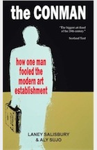
The Conman: How One Man Fooled the Modern Art Establishment by Laney Salisbury and Aly Sujo


An illuminating view of the man who conned the art world grips David Pallister

Good art forgers have received what amounts to an endorsement from an unexpected quarter. Promoting the National Gallery's forthcoming exhibition Close Examination: Fakes, Mistakes and Discoveries, the director Nicholas Penny said: "I wish we had more fakes [in the collection]. You only get good at spotting them by seeing them." Penny touches a sensitive nerve in the secretive international art market which, according to expert estimates, is awash with forgeries. Astonishingly, some put the figure at up to 40%.
Forgers are a peculiar breed and money is only one motive. Anonymous by necessity, they yearn for recognition. Technically adept, often with formal training and a keen sense of colour and form, they have produced work, down to the singular brushstroke or cut of the clay, that rivals the originals. But, by definition, they have not found their own voice; they are unable to put their name to pieces of modest integrity and flair when they know that they are capable of simulating the greats. Lacking the prerequisite metropolitan social connections, they find the international art market – the galleries and auction houses of New York, London and Paris – intimidating, haughty and false: a mercenary, self-regarding conspiracy against the blooming of a thousand flowers. So beating the market is a challenge and a game: fraught with danger but ultimately exhilarating.
To varying degrees, of course, they are aware of the necessity for other technical subterfuges: the choice of paper and frame, the particular hue of the blue, the varnish and the sense of age – and how exactly did that painter scrawl his name? Experts who arbitrate authenticity often have only an instinct. "It's off," they might murmur. Or "It's not quite right."
It's extraordinary that John Myatt, an impoverished part-time art teacher and failed songwriter from Staffordshire, managed to get away with it for so long – producing more than 200 paintings over 10 years, which were sold around the world for a total of about £2m. With an aversion to the smell of expensive oils, which also took a long time to dry, he used house paint mixed with turpentine, linseed oil and lubricant jelly. His favourite targets were the modernists, the cubists Gleizes and Braque, Ben Nicholson, Nicolas de Stael, Giacometti and a dozen others.
But whatever doubts were harboured by the experts – and there were many – they were assuaged by that other essential ingredient of the good fake: the provenance. Laney Salisbury and Aly Sujo, two American journalists, have produced a riveting and perceptive account of Myatt and his Svengali – the obsessive and enigmatic fantasist John Drewe, who, with charm and apparent wealth, insinuated himself into some of Britain's leading art institutions and then systematically falsified and corrupted their archives to create bogus histories for Myatt's fakes. The two men met in 1986 when Myatt, struggling to bring up his two children, placed a personal ad in Private Eye offering "genuine fakes". He was impressed when a Professor Drewe called and offered him commissions. It took a while before Myatt realised – only half-reluctantly – that he was being drawn into a gigantic fraud.
Drewe was in fact the son of a telephone engineer and had left school at 16. But, brimming with self-confidence and erudition, he passed himself off as a nuclear scientist as he cruised around London in his chauffeur-driven Bentley, dining the great and the good of the art world at expensive restaurants. The Tate was a particular target and his £20,000 donation earned him privileged assess.
Salisbury never met Drewe (he was sent to prison for six years in 1999). But she and Sujo (who died in 2008) have beautifully captured his manic, intense and unstable personality, one moment oozing with charm, the next with menace. The gullibility and the greed, deliciously described, make for compulsive reading. They have even caught his loose-limbed gait, his obsequiousness smirk, and strange staccato laugh disconnected from humour. I can testify to their uncanny accuracy. Shortly after his arrest in 1996 but before he was charged, Drewe pitched up at the Guardian with a convoluted and utterly improbable tale of being a high-level physicist involved in selling a secret cache of art to fund shady Balkan arms deals and much more. I was invited to his substantial house in Reigate to see his "evidence". At the time the Guardian was embroiled in its high-profile libel battle with the Tory politician Jonathan Aitken and, sure enough, the canny Drewe had inserted into one of his files an intriguing reference to Aitken.
Every one of his assertions that could be checked out proved to be a lie, and when confronted he flew into a rage, dashing off a five-page denunciation of me to the editor. It became clear later, when he drove the prosecution (and the judge) in the case against us to despair with his rambling, conspiratorial rants, that his approach to the paper was just another attempt to spread algae on muddy waters.
Drewe's downfall came from an unexpected source, which pitches Salisbury's tense narrative into the realm of thriller. In 1993 Drewe left his Israeli partner, Batsheva Goudsmid, an eye doctor, for another woman and wrongly accused her of mental instability and abuse of their children. Goudsmid took her suspicions and a briefcase full of Drewe's forgery kit, which he had left at their house, to the police. Scotland Yard's art and antiques squad were alerted and Goudsmid turned up two black rubbish bags full of incriminating documents. The story of the painstaking, two-year investigation that led to Drewe's appearance at Southwark crown court is a wonder.
And Salisbury is able to sign off with a happy ending. Myatt served four months of a one-year sentence and has since become a celebrity – selling "legitimate fakes", lecturing and starring in several TV series, the latest of which, Virgin Virtuosos, is currently being shown on Sky Arts.
David Pallister is co-author of The Liar: Fall of Jonathan Aitken (Fourth Estate).

http://www.theguardian.com/books/2010/apr/10/the-conman-salisbury-sujo-review

Tuesday, November 26, 2013

Famous Forgers of Oil Paintings


http://0.tqn.com/d/arthistory/1/0/H/1/1/picasso_themes_moma_2010_09.jpgArtists such as Van Gogh, Gauguin, Manet, Sisley, Cézanne and Renoir reached fame after their deaths and were therefore much copied.  

However, it was during World War Two that forgers became extensively busy. As soon as the Germans invaded a large part of Europe, Nazi leaders enacted a plan to plunder famous oil paintings belonging to their political opponents and Jewish families. The main Nazi leader involved in the theft of old master oil paintings was Hermann Goering who formed his own extensive collection.

Goering was interested in masterpieces and was told one day that he could obtain some oil paintings by Vermeer in Holland. The Nazi leader went on to buy one of them, Mary-Magdalene washing the feet of Christ, from the art forger  Hans Van Meegeren. In the 1930's, several experts, including Bredius, the best specialist for Vermeer's works, had said they had no doubts about the authenticity of this work.

At the end of the war, Van Meegeren was arrested on charges of collaborating with the Germans because he had sold Goering the Vermeers. While in prison, Van Meegeren baffled art specialists by confessing that he had in fact forged oil paintings certified as by Vermeer and sold to Goering as well as to other art collectors.

Peeved at being considered an obscure untalented artist, Van Meegeren told investigators that fooling art experts had been his revenge. He added that it had been quite exciting to fool art critics who had scorned his own works.  

The war did not affect the art market for oil paintings much especially in occupied Paris where the art trade blossomed despite economic restrictions. With the return of peace, the French capital became the main art trade centre while the United States was just seeing the emergence of its modern school of painters.  

The oil paintings of Picasso, Braque, Matisse, Miro, Dali were now famous and the art market was in constant development. The late sixties forgers saw the appearance of several renowned art forgers including David Stein, Elmir de Hory and Real Lessart. The former being specialised in fake Chagall, Picasso, Dufy and post-impressionist oil paintings, the latter two working for an agent called Fernand Legros who was selling his fine art reproductions with forged certificates. A former ballet dancer, Legros fooled a few rich American magnates, including Arthur Meadows, the owner of the General American Oil Co. in Texas.

Legros once used a subtle stratagem on entering American territory. When asked by U.S customs what was in his luggage, Legros explained that the oil paintings he was bringing were merely fine art reproductions. Eager to verify, U.S customs officials would call upon art experts to determine whether Legros was not trying to cheat them and driven by such suspicion, these art specialists concluded that these fine art reproductions were in fact genuine oil piantings. Unmoved by the fine imposed on him Legros would then further impress his customers by showing them the U.S customs documents proving the authenticity of the hand painted, fine art reproductions he was selling.

David Stein, who had managed one day to have a forged Picasso oil painting authenticated by the master himself, was arrested after Marc Chagall saw a forged oil painting exhibited in a New York Gallery. He later started a career as a painter after serving a prison term.  

Elmyr de Hory, who lived on the island of Ibiza, made hundreds of oil painting forgeries including works signed Van Dongen. The Dutch artist , apparently in need of money near the end of his life, endorsed more than once the fakes  sold by Legros as being genuine Van Dongens.  

In the 1960's certain artists repudiated some of their own oil paintings because they felt dissatisfied about the quality or about the low prices at which these were sold. This was notably the case with the Italian master Giorgio de Chirico who was charged in 1969 for having seized some of his sculptures as forgeries whereas he had signed a legal contract for their production. Another master, Maurice de Vlaminck refused to authenticate some of his own oil paintings simply because he did not like them anymore. He also was charged and received a fine for having rejected an oil painting which was in fact genuine.
 
In England, many experts were undermined by the Keating scandal in the 1970's. Tom Keating had made a speciality of producing forged water-colours by Samuel Palmer and oil paintings by Flemish, Dutch, English and French old masters.  

Keating, who came from a poor London family, failed to reach fame and therefore wanted to avenge himself by producing forgeries of oil paintings and drawings which were to be certified as genuine works by Gainsborough, Degas, Boucher, Fragonard, Renoir, Modigliani and Van Dongen.

Other artists who have been forged include Van Gogh, Boudin, Vuillard, Matisse, Léger, Braque, Utrillo, Rouault, Jean-Michel Basquiat, Franz Kline, Marie Laurencin, André Lhote, Chaïm Soutine, Modigliani and Signac. It is estimated that over 15% of paintings sold throughout the world are fakes.  

Why Creative People Sometimes Make No Sense

8467672229_6b6f89a685_k

Why Creative People Sometimes Make No Sense

Posted by Matthew in for us
I’ve been having an insightful shuffle through Mihaly Csikszentmihalyi’s book Creativity: The Work and Lives of 91 Eminent People. Mihaly is a seminal professor of Psychology and Management, and is the Founding Co-Director of the Quality of Life Research Center at Claremont. He writes:
“I have devoted 30 years of research to how creative people live and work, to make more understandable the mysterious process by which they come up with new ideas and new things. If I had to express in one word what makes their personalities different from others, it’s complexity. They show tendencies of thought and action that in most people are segregated. They contain contradictory extremes; instead of being an individual, each of them is a multitude.”
Nine out of the ten people in me strongly agree with that statement. As someone paid to be creative, I sometimes feel kaleidoscopic in my views or opinions, and that “multitude” of expressions sometimes confuses those around me. Why does that happen? My thoughts make cohesive sense to me, yet others sometimes feel that I am contradicting myself or switching positions. What is wrong with me?
Mihaly describes 9 contradictory traits that are frequently present in creative people:

01

Most creative people have a great deal of physical energy, but are often quiet and at rest. They can work long hours at great concentration.

02

Most creative people tend to be smart and naive at the same time. “It involves fluency, or the ability to generate a great quantity of ideas; flexibility, or the ability to switch from one perspective to another; and originality in picking unusual associations of ideas. These are the dimensions of thinking that most creativity tests measure, and that most creativity workshops try to enhance.”

03

Most creative people combine both playfulness and productivity, which can sometimes mean both responsibility and irresponsibility. “Despite the carefree air that many creative people affect, most of them work late into the night and persist when less driven individuals would not.” Usually this perseverance occurs at the expense of other responsibilities, or other people.

04

Most creative people alternate fluently between imagination and fantasy, and a rooted sense of reality. In both art and science, movement forward involves a leap of imagination, a leap into a world that is different from our present. Interestingly, this visionary imagination works in conjunction with a hyperawareness of reality. Attention to real details allows a creative person to imagine ways to improve them.

05

Most creative people tend to be both introverted and extroverted. Many people tend toward one extreme or the other, but highly creative people are a balance of both simultaneously.

06

Most creative people are genuinely humble and display a strong sense of pride at the same time.

07

Most creative people are both rebellious and conservative. “It is impossible to be creative without having first internalized an area of culture. So it’s difficult to see how a person can be creative without being both traditional and conservative and at the same time rebellious and iconoclastic.”

08

Most creative people are very passionate about their work, but remain extremely objective about it as well. They are able to admit when something they have made is not very good.

09

Most creative people’s openness and sensitivity exposes them to a large amount of suffering and pain, but joy and life in the midst of that suffering. “Perhaps the most important quality, the one that is most consistently present in all creative individuals, is the ability to enjoy the process of creation for its own sake. Without this trait, poets would give up striving for perfection and would write commercial jingles, economists would work for banks where they would earn at least twice as much as they do at universities, and physicists would stop doing basic research and join industrial laboratories where the conditions are better and the expectations more predictable.”
Sometimes what appears to be a contradiction on the surface is actually a harmony in disguise. My problem has been primarily one of communication. I am learning to let people know what I am thinking and why, and explaining myself in a way that helps them understand why I am discussing multiple perspectives instead of just cleaning stating my own. At first it might not make sense, but give me/us long enough, and it will.
Photo by Sophia.

http://www.matthewschuler.co/why-creative-people-sometimes-make-no-sense/

Friday, November 22, 2013

More Vibrant Tales of Obsolete Pigments

More Vibrant Tales of Obsolete Pigments

by Allison Meier 

Vintage paint tubes (photograph by Jody Morris/Flickr user)
After our first installment of obsolete pigments, we had such a strong response that we realized we’d only hit the tip of the curious history of vanished colors. Below are a few more pigments that have mostly gone out of favor, due to them being hazardous to the health of their manufacturers or artists, having a shortage of their weird material (antlers, for example), or just advances in technology replacing them with synthetics.

Orpiment

Detail of Jan Davidsz. de Heem's "Festoon with Flowers and Fruit" (1660s), oil on panel, said to have been painted with orpiment (via Wikimedia)
Detail of Jan Davidsz. de Heem’s “Festoon with Flowers and Fruit” (1660s), oil on panel, said to have been painted with orpiment (via Wikimedia)
Made from arsenic and sulphide, orpiment was naturally very toxic. According to New Scientist, the vivid “King’s Yellow” as it was known was very popular with 17th century Dutch masters, sometimes mixed with blue to make their landscapes green. Yet not only were the fumes poisonous, it also apparently smelled horrid. Furthermore, it would react with the then-common lead pigments. As John Emsley’s The Elements of Murder: A History of Poison describes, “not all artists were so enamoured because it caused other pigments to turn black if it was painted over, and this was especially so if they were using white lead, which slowly reacted with the sulphur in the orpiment to form black lead sulphide.”

Hartshorn

One pigment that could mix with the above mentioned orpiment was Hartshorn. Yet the rustic-feeling white got its natural color from calcined deer antlers, which are hard to keep in abundant supply.

Ivory Black

Rembrandt, "Old Man with a Gold Chain" (1631), oil on panel (via Wikimedia)
Rembrandt, “Old Man with a Gold Chain” (1631), oil on panel (via Wikimedia)
Hartshorn, however, is not the only bone-based pigment that was once popular. Ivory Black, which was made from singed elephant tusks and other ivory, and bone char, were also used, and were particularly fond of artists like Rembrandt who would paint swathes of black on their work. According to Art in the Making: Rembrandt by David Bomford, the blacks the artist used were “almost always provided by bone or ivory black, prepared, as the name suggests, from animal bones or waste ivory by charring in a closed crucible.”

Paris Green

To go along with those infamously poisonous pigments is the notorious Paris Green. The incredibly toxic pigment was an effort to improve Scheele’s Green, a copper arsenite, with Paris Green involving arsenic and verdigris (see below). It gets its name from being used to kill rats in the sewers of Paris, and it was also used as an insecticide, but that was all after it had already been used as a pigment in art and other uses, including, most hazardously, wallpaper where when combined with moisture it released an arsine gas.

Iris Green

The Antichrist on the Leviathan, from "Liber Floridus" (1120). Illuminated medieval manuscripts regularly used Iris Green. (via Google Books)
The Antichrist on the Leviathan, from “Liber Floridus” (1120). Illuminated medieval manuscripts regularly used Iris Green. (via Google Books)
For a less deadly green, illuminated medieval manuscripts were frequently colored with the iris flower in a color called Iris Green. As the Pigment Compendium by Valentine Walsh and Tracey Chaplin describes, the juice from petals of plants such as parsley, nightshade, rue, and honeysuckle were frequently used, but it was the iris that gave a nice color from its blue and purple petals. Yet it was a time consuming process and required a whole heap of flowers to have enough juice to pull out the pigment (sourced from chlorophyl) with scraps of linen.

Sepia Ink

Sepia color has far from vanished, although its original main ingredient is not so common. The sepia pigment was originally made in the 18th century from ink sacs taken from animals, particularly cuttlefish (cuttlefish bones were also sometimes used in pigments). According to Painting Materials by R.J. Gettens and G. L. Stout, “the secretion from one cuttle-fish [was] able to turn a thousand gallons of water opaque in a few seconds.”

Smalt

Smalt used in Hans Holbein the Younger's "Sir William Butts" (1540–43) (via National Portrait Gallery/Wikimedia)
Smalt used in Hans Holbein the Younger’s “Sir William Butts” (1540–43) (via National Portrait Gallery/Wikimedia)
The powder blue color of Cobalt Blue glass found its way into a pigment called Smalt. It was an affordable color as it was made from ground up blue glass, and the Renaissance painters frequently used it to add a shimmer to their work. You can also see it in Vermeer’s early pieces, like “Diana and her Companions,” as well as some portraits by Hans Holbein the Younger.

Uranium Yellow

Uranium gives off an entrancing glow, and that characteristic made an appearance as a pigment in glass and ceramics. Although the radioactivity of Uranium Yellow wasn’t as hazardous as, say, eating White Lead paint or using Paris Green, it was enough to stop its use.

Gamboge

Gamboge, a yellow resin-based pigment sourced from trees in Cambodia, has a rather macabre story as it progressed from the 19th century into the 20th. As Radiolab reported in “The Perfect Yellow,” during that century’s wars, unspent bullets and mud from battlefields were getting mixed into the Gamboge collected.

Verdigris

Veronese's "Allegory of love," where the fabric pattern in the background painted with Verdigris has turned from green to brown over the years (via Wikimedia)
Veronese’s “Allegory of love,” where the fabric pattern in the background painted with Verdigris has turned from green to brown over the years (via Wikimedia)
The chemistry of the canvas also resulted in the once widely prevalent Verdigris, a bluish green, almost entirely disappearing. It was used in the Middle Ages through the 19th as a popular vibrant green, made with copper plates and acetic acid. This tactic made it very unstable, however, and it would get darker with age. However, as Philip Ball points out in his book Bright Earth: Art and the Invention of Color, this may have been a result of mixing it with resin, and that organic addition later turning it black.

http://hyperallergic.com/74922/more-vibrant-tales-of-obsolete-pigments/

Wednesday, November 20, 2013

The Colorful Stories of 5 Obsolete Art Pigments

Paints-640
The colors of art change not just with trends, but availability as well. For reasons of being incredibly poisonous, expensive, or just involving way too many snails, here are five pigments that have disappeared from art.

Maya Blue

Mayan Mural, involving the Maya Blue pigment (via Wikispaces)
On murals, pottery, even possibly painted on the hapless bodies offered as human sacrifices, a sky-blue color has been found in artifacts of the Maya and Aztec. It disappeared around colonial times in Central America, just like the pre-Columbian civilizations themselves. Known as Maya Blue, it’s long been recognized as a mix of a natural clay and a dye from the indigo plant, but how it was so durable in not being subject to fading or even the deterioration of solvents and acids has been a mystery. Earlier this year, however, some chemists announced they may have found the secret in careful variations in the preparation temperatures.

Tyrian Purple

Burial Shroud of Charlemagne (early 9th century), made of Byzantine silk colored with Tyrian Purple (via Wikimedia)
The most prized, prestigious pigment of the ancient world was actually made from a rather slimy source: a predatory snail. Tyrian Purple got its name from the best of the marine shellfish used to make the pigment being found off the shore of Phoenicia’s Tyre, according to Pigment Compendium. Not only was it a properly royal color of rich, slightly red purple, it was said to get even more beautiful and brighter when exposed to the sun and the elements. Yet since you needed a whole pile of snails to have enough mucous secretions to make it, it was very expensive, and eventually disappeared.

White Lead

vermeerglassofwine
White Lead in Johannes Vermeer’s “The Glass of Wine” (1658), oil on canvas (via WikiPaintings)
The luminosity of classical European oil paintings was due in large part to White Lead, a pigment of lead carbonate and sulfate. Artists like Vermeer used it to create a special kind of light that radiated from the canvas, the traces of which we can see in its grainy texture. Unfortunately, its striking brightness was rather poisonous. Yet as Applied Polymer Science explains about the lead paint: “Toxicity was recognized, but accepted.” It’s since been largely replaced by Titanium White, a less hazardous, although not as structurally strong, pigment, yet some artists still seek out the White Lead for its believed superior color and permanence, even if it is more difficult to find and still toxic.

Lapis Lazuli

Lapis Lazuli used in a detail of "The Ascension," attributed to Jacopo di Cione (1371) (via The National Gallery, London(
Lapis Lazuli used in a detail of “The Ascension,” attributed to Jacopo di Cione (1371)
(via The National Gallery, London)
Widely believed to be the most expensive pigment ever created, more pricey than even its weight in gold, the Lapis Lazuli pigment was made from grinding up Lapis Lazuli semi-precious stones. Its use goes back to the 6th century in Afghanistan, but its popularity really took off with wealthy Renaissance patrons who wanted the stunning blue on the robes of Mary and Jesus in religious paintings. The “ultra marine” color, as it was also known, largely disappeared as it was so incredibly expensive and required quarries to collect the stones. However, you can actually buy it at at the Kremer Pigmente store in Manhattan for $360 for five grams.

Dragon’s Blood

Mural in the Villa of Mysteries in Pompeii, said to incorporate the Dragon's Blood pigment. (via Wikimedia)
Mural in the Villa of Mysteries in Pompeii, said to incorporate the Dragon’s Blood pigment. (via Wikimedia)
The pigment known as Dragon’s Blood had the most epic and ridiculous of origin stories, a supposed mix of actual dragon’s blood and elephant’s blood. Andrew Dalby’s Dangerous Tastes chronicles this incredible story from the 16th century navigator Richard Eden:
“[Elephants] have continual warre against Dragons, which desire their blood, because it is very cold: and therefore the Dragon lying awaite as the Elephant passeth by, windeth his taile, being of exceeding length, about the hinder legs of the Elephant, and when the Elephant waxeth faint, he falleth down on the serpent, being now full of blood, and with the poise of his body breaketh him: so that his owne blood with the blood of the Elephant runneth out of him mingled together, which being colde, is congealed into that substance which the Apothecaries call Sanguis Draconis, that is Dragons blood, otherwise called Cinnabaris.”
As freaking exciting as a battle between an elephant and dragon would be, the pigment was in actuality made from a Southeast Asian tree — though the story certainly helped hype it to outside buyers, and its blood red color was popular in the ancient world. It faded out of mainstream popularity around the 19th century, probably alongside the very much waning fascination with elephant vs. dragon battles.

UPDATES:

Mummy Brown

Martin Drölling, "L'intérieur d'une cuisine" (1815), believed to have been painted with Mummy Brown (via the Louvre)
Martin Drölling, “L’intérieur d’une cuisine” (1815), believed to have been painted with Mummy Brown (via the Louvre)
A fantastic Twitter tip from Art vs Artifact informed us of another vanished pigment with an incredible story: Mummy Brown. The pigment, a favored shade of the Pre-Raphaelites, was first made with Egyptian mummies, both cat and human, that were ground up and mixed with white pitch and myrrh. It had a great fleshy color, but due to the actual fleshy components it would crack over time. Martin Drölling, who painted the work shown above, reportedly used the mummies of French kings dug up from Saint-Denis in Paris. According to a 1964 Time story, the Mummy Brown pigment didn’t last due to a shortage of its name defining ingredient. Managing director of the London based C. Roberson color maker told the magazine:
“We might have a few odd limbs lying around somewhere, but not enough to make any more paint.”

Indian Yellow

Here’s another curious, and unsettling, pigment tip from Twitter on Indian Yellow. According to Philip Ball’s Bright Earth: Art and the Invention of Color, the vivid color of Indian Yellow was a source of mystery until the late 19th century. It turned out that the yellow color came from the urine of cattle in the Bihar province of India that were fed only mango leaves and water. The mistreatment of the animals led to the color being illegal and it vanished by 1908.

Scheele’s Green

From the comments, we got a tip on Scheele’s Green. The yellow-green pigment was a cupric hydrogen arsenite, which was very toxic, yet made it into not just paintings, but candles, wallpaper, and children’s toys. In one incident at a Christmas party, a candle dyed with the color poisoned children, and other 19th century incidents include women in green dresses passing out and those using it to print newspapers suffering from its effects. The arsenic vapors also are believed by some to have played a role in the death of Napoleon, who lived in a room paintly brightly green, his favorite color, as traces of arsenic were found in his hair.

http://hyperallergic.com/74661/the-colorful-stories-of-5-obsolete-art-pigments/

Monday, November 18, 2013

A View from the Easel

by Philip A Hartigan

CHICAGO — The 50th installment of a series in which artists send in a photo and a description of their workspace. Want to take part? Submit your studio — just check out the submission guidelines.

Joan Blackwell, Pembroke, North Carolina (site)

Blackwell-640
As an Art Education major at University of North Carolina, I am always working on new art pieces. This sunflower was done at my kitchen table. This art piece was created for my neighbor, after spending hours trying to buy one, without any luck. I decided to surprise her and paint the sunflower art. There is a lot of light from the French doors in the kitchen. I enjoy looking out the windows to see flowers, birds and the green grass. I always feel inspired working here. While I do have a designated art studio, I prefer this kitchen area to work. Creating an organized, clean, pretty working environment is essential for me to produce art.

Karen Fitzgerald, Long Island City, New York (site)

KarenFitzgeraldSTUDIO-640
This is the west-facing end of my studio with my paint table under the window and my main work table next to the green rocker. I’ve been in this space for nine years. It has the most gorgeous light, east to west. I’m a morning person and I love the light as it floods in from another big window on the east side.
Luminosity plays a big part in my work as well as the process of making it. I work with gilded grounds and find myself constantly using reflected light when gilding, sealing, and working with paint washes. At 325 sq. ft., this is not the biggest studio I’ve ever had, but it feels like the most luxurious: I have a kitchenette with a granite counter, and plenty of floor, and wall space. I work on the floor frequently and have lined it with paper to keep it clean.

Aleks Slota, Berlin, Germany (site)

aleks_slota-640
My studio is located in an industrial part of east Berlin. The location is really inspiring due to the abundance of strange abandoned buildings, giant apartment blocks, and the Vietnamese warehouses down the street. The setup of the studio changes all the time. I’m predominantly a performance artist but I also work with photography, video, and sound.
In the photo you can see the lit up stage for a photo series, also a pile of fabrics, and costumes in progress. The table on the left side has drawing and painting supplies, boxes of inks, and makeup. On the shelves I have art history books and art DVDs for inspiration.

Elise Engler, Manhattan, New York City (site)

Engler-640
The studio is the 300 square foot would-be living room of my Upper Westside apartment. It is good to have a studio where I live, as I can work any time, even if it is just for a few minutes. Drawing and painting with gouache take place at the large drafting table in the center. There are baskets of hundreds of color pencils on the cart next to the table. The table is usually pushed against the corner storage rack but now it is pulled out so I can stand on a step stool and see out the window on the right.
Daily I photograph the ever-changing construction site across the street. My drawing is documentary in nature — this construction site may constitute the next project. Occasional bouts of oil painting take place on the other side of the room where there is also a 44” digital printer — it is shockingly larger than an upright piano. I am using it to print a series of books of my drawings.

Craig Rempfer, Brooklyn, New York (site)

Rempfer-640
My current studio is in my room, and it has been for about one year. Although space is limited at the moment, having a long, flat table still allows me to make drawings of moderate size. The paint brushes have been in storage for a while but I feel that due to this minor setback of space and ventilation, I’ve been able to hone in on my drawing practice that otherwise may have been shrugged off.

Richard A Jacobson, Toronto, Ont (site)


On of my dreams was to have my easel in view, no matter where I was in my living space so that I could at any time look over and see the current painting. I've been here now for 2 years and still fins myself marveling at how lucky I am.

Thursday, November 14, 2013

Single Point Perspective: “The Most Beautiful Drawing in the World”

by Thomas Micchelli

9. Head of a Young Woman_15572
Leonardo da Vinci, “Head of a Young Woman (Study for the Angel in the ‘Virgin of the Rocks’)” (1480s) (Image courtesy of the Morgan Library & Museum, New York)
The centerpiece of the stunning new exhibition at the Morgan Library & Museum, Leonardo da Vinci: Treasures from the Biblioteca Reale, Turin, is “Head of a Young Woman,” which Bernard Berenson, the renowned authority on Italian Renaissance art, called “one of the finest achievements of all draughtsmanship.”
Kenneth Clark, the British art historian, went his mentor Berenson one better, declaring it “one of the most beautiful, I dare say, in the world.”
It’s easy to build up resistance to an image as endlessly reproduced as “Head of a Young Woman” — its ubiquity makes it feel tiresome and tapped out — but a few moments in front of it quickly belies such assumptions. Berenson and Clark weren’t bluffing. It’s one of those rare works of art that you can drink in forever.
The drawing was made in the 1480s with metalpoint, a notoriously exacting medium, on buff prepared paper. As explained by Per Rumberg, Associate Curator of Drawings at the Morgan and principal curator of the show, metalpoint leaves no trace on untreated paper, but when a surface is coated with glue or gesso, the stylus tip (which could be gold, silver or lead) physically incises the surface, leaving no opportunity for erasure.
The metalpoint in “Head of a Young Woman” is both delicate and grating, which will startle anyone expecting the work to be an exercise in Renaissance finesse. Several lines repeatedly plane down the width of the nose until it achieves a polished, classical angularity, while others tumble down the left side of the face, cutting through the forehead, eye and cheek, as if they were trial runs for where the edge of the head might end. They can be read as stray strands of hair, but there is something distracting and off-target about them. There are similar hesitations and revisions along the throat and shoulders, and the two bold, diagonal strokes denoting creases in the skin of her neck as she turns to gaze at the viewer appear hasty and misplaced.
In other words, the drawing is imperfect, which is essential to its probing, critical, transporting beauty. Leonardo’s inquisitive hand never settles on a single way of seeing or doing: the cheek on the right is molded with an exquisite caress, with the artist’s distinctive left-to-right hatch marks cascading like sheets of water, while the shadow across the woman’s back feels bluntly swiped in, as if he saw no reason to spend time on it. The dancelike curls delineating the locks of hair trailing down her spine are rendered minimally, almost abstractly, even as the minute strokes of white gracing her nose, cheeks and eyelid return the drawing to a moist, porous realism.
The disjunction among the various parts, however, ultimately coheres around the eyes, which are absolutely mesmerizing — liquid orbs that seem to glow from within. The magic is again in the imperfection: the iris of the right eye (on our left) is circular while the other, which drifts a little to the right, is an ovoid, as if it were compressed beneath the weight of the eyelid. But its unusual shape, which is more directional and relational than a circle could be, allows it to commune with the small, untouched patch of paper on its immediate right, creating a raccoon-like band that’s perpendicular to the angle of the nose. That band then leaps across the bridge of the nose to terminate in the pupil of the self-contained, circular eye. The angled T formed by this convergence creates a focal point that unites the variegated sections of the young woman’s head.
Such a formal breakdown does little justice to the drawing’s breathtaking gestalt, the aching beauty sewn by light and shadow as they sweep across a surface that remains predominantly blank. The emptiness is key: the drawing’s unearthly splendor materializes out of nothing and dissipates before our eyes. We are riveted by its extreme pleasures, but at the same time we are acutely aware that such intensity can exist only in its presence, an understanding that suspends us in an irresolvable state of elation and grief — a sensation, like love, that we never want to come to an end.

Leonardo da Vinci: Treasures from the Biblioteca Reale, Turin continues at the Morgan Library & Museum (225 Madison Avenue, Midtown, Manhattan) through February 2, 2014.

http://hyperallergic.com/91475/single-point-perspective-the-most-beautiful-drawing-in-the-world/

Chuck Close on Sesame Street